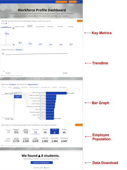
The Workforce Profile Dashboard
The Workforce Profile Dashboard displays data visualizations based on profile information entered by your organization’s employees. You can examine trends in profile data, view data distribution across groups, and download data in Microsoft Excel format for further analysis.
Your access to profile data is the same as your access to HLC student data. For example, if you only have access to Radiology department students in the HLC, you will only see profile data for members of the Radiology department in the Workforce Profile Dashboard.
The Workforce Profile Dashboard contains several sections, each of which displays or enables you to filter data about your organization’s employees.

A global filter feature enables you to narrow the data that the dashboard displays, so you can focus on specific areas of your organization’s workforce.
Key Metrics and Trendline Sections

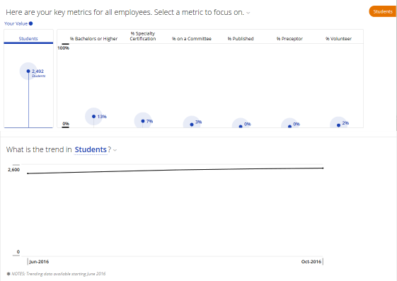
The Key Metrics section displays a visual representation of your employees’ profile data. In addition to the total number of employees (“students”) who have entered professional profile information, this section also displays graphs for
% Bachelors or Higher – percentage of your workforce whose education records indicate a degree level of Bachelors, Masters, Doctorate, PhD, or MD, and the completion year is populated with a valid date.
% Specialty Certification – percentage of your workforce with a certification considered a specialty certification that has not expired.
% on a Committee – percentage of your workforce currently holding a position on a committee.
% Published – percentage of your workforce with a research & publication record that is marked as published.
% Preceptor – percentage of your workforce with a teaching & preceptorship record that has a type of Preceptorship and is marked as current.
% Volunteer – percentage of your workforce with a volunteer service record that is current.
Clicking a Key Metrics graph displays the trend for the selected metric in the Trendline section.
The Bar Graph and Employee Population Sections

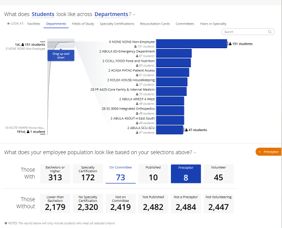
The Bar Graph section displays how selected key metric data is distributed across the following groups:
For example, if you select % Bachelors or Higher in the Key Metrics section, and then select Departments in the Bar Graph section, you will see a bar graph that displays how employees who hold at least a bachelor’s degree are distributed across all of the departments in your organization. Each bar will represent a different department in your organization.
Each bar in the bar graph is a filter: you can click bars to select them and filter the remaining sections of the dashboard to focus on the groups that you selected.
The Employee Population section displays statistics about your organization’s workforce. By default, all employees are included; if you selected any groups in the Bar Graph section, only those employees in the selected groups will be included in the Employee Population section.
Each statistic group in the Employee Population section (e.g., Bachelors or Higher, Not Published) acts as a filter: selecting a statistic group will restrict the data download to the students included in the selected groups.
The Data Download Section

From the Data Download section, you can download the following kinds of profile data about your employees:
Viewing Trends in Profile Data
Viewing Profile Data Distribution across Groups